Colored Pencil and Watercolor
Colored Pencil Forms
|
|
To start off our colored pencil and watercolor unit, we began by experimenting with colored pencils. In class we drew a sphere and a cone first and determined our light source, shown as a yellow circle or sun. We picked three colors, a dark, medium, and light value, plus a white colored pencil to use on the shape to show value. You can see with my first sphere and cone on the brown paper in the top right corner how these colors were blended together on the shapes. For each sphere, I used dark purple for my darkest color, blue for my medium value, and light green for my light value. I used a dark navy blue to help darken the shadow. For each cone, I used red as my darkest value, orange for my medium, and yellow for my light value, and to add to the shadow, I used a red-ish purple. I placed the pictures in the order that I drew them, and it is fun for me to be able to see how much I progressed while practicing using my colored pencils to show value. Before this unit, I had mainly just messed around with colored pencils, and didn't know how to blend the different colors together. This unit taught me how to press down harder or softer, or layer colors, with the pencils to show different values, and how to show dimension, depth, and value with colored pencils.
|
Watercolor Techniques
|
Following colored pencils, we worked with watercolors. The first thing we did was learn about the different techniques used in watercolor paintings. Starting with gradient, we picked two colors to fade into each other. I picked red and blue, and starting very dark at either end, gradually brought the two colors together, getting lighter and lighter as I came to the middle. Next, we saw how different layer could make a color darker. The first wash wash diluted heavily to make it really light, and each layer after was applied a with a little more color in it after the previous layer had dried to prevent them from bleeding into each other. Then we went on to apply a layer of water in the next box. Using the paintbrush, we dropped color and water in different places and let them merge together to create a blurred look. This section took the longest to dry, as it used a lot of water. Lastly on the top row, we painted a layer of one color and let it dry. Then we took a very wet paintbrush with color on it to paint on top of the dry layer. This allowed the first layer to show through the other layers of color. To start off the second row, we dried off our brush and got just enough water to hold paint on it. This techniques allows for more controlled brush strokes. Next, we painted a light wet layer. Then, as it was drying, I took a paper towel and dabbed the paint in different areas, leaving lighter spots. The following technique we tried was similar to the first one, but only involved one color this time. Next, we took a water color pencil and scribbled a little to get a spot of the pigment. Then we brushed water over it and the pigment dissolved into the water and spread over the section. Finally, we did the splatter technique. I took a little wet paint on the tip of my brush and flicked it onto the page using my fingers.
|
|
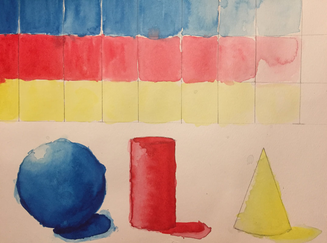
Watercolor Value Chart and Forms
|
After learning about the different techniques used in water color painting, we used the three primary colors, blue, red, and yellow, to practice creating value in value charts and on a sphere, cone, and cylinder. The value charts included three steps, from darkest to lightest. The hardest part about the value charts was that if you didn't wait long enough for the surrounding boxes to dry, the colors bled into the other boxes around it. However, once I learned this, the following value charts improved. Next, we worked on the shapes, to add dimension and value. While painting these shapes, I ended up using too much water, so the end result is a little messy. After letting a coat dry, you could add another coat and make the shape darker in some areas. With layers, you will end up with bands, though, so I had to go back over the shapes to fix the banded look. If I painted the value chart and the forms with water color again, I would most definitely take a lot more time to create the different steps in the value chart and the value in the shapes. I would also fully allow everything to dry so the different colors or layers wouldn't bleed into each other as much.
|
Perspective
1 Point Perspective Practice
|
To learn how to create more complicated perspective pieces with lots of vanishing points, we started by learning how to create a basic 1 point perspective drawing, which has only one vanishing point. We followed along with tutorials, first creating basic shapes, then street scenes, and finally a bedroom. The basic shapes were pretty easy to make, and the hardest part about it was making sure all of the lines were parallel and straight. The street scenes were really fun to make. When the vanishing point was in the center of the page, it was a little easier to visualize walking down a street and seeing the image I drew. When the vanishing point was in the top left of the page, however, it showed me a new way to draw 1 point perspective pieces. Drawing the street scenes also helped me learn how to draw a realistic line of trees in the picture that are all proportionate. The last tutorial, which helped me draw a 1 point perspective room, was the most complicated. My final piece looked very different than the tutorial drew it, but I was okay with that. It gave me the chance to branch out and try something new, such as the side table and hardwood floors. If I attempted the bedroom drawing again, I would draw the back wall a little bigger so I could have fit more things along it, and I would try to draw something underneath the window in the main room, or something in either the back or side room. Overall, I think that 1 point perspective drawings were pretty easy to create.
|
|
2 Point Perspective Practice
|
Next in our perspective unit, we learned how to create a little more complicated drawings; 2 point perspectives, which feature 2 vanishing points. Watching tutorials, we first created basic shapes with the 2 vanishing points. I chose to go over my shapes in pen so that I would be able to see the shape without having to erase all of the other guide lines I drew to create to shape. Later in the first tutorial we watched, the instructor also taught us how to draw a simple city scene. This city was more complicated than the cities we drew in 1 point, but was less difficult to draw than it seemed. I started with the road and the building in the center, adding more buildings to the background as the drawing progressed. For the final touch, we added trees, mountains in the background, a sidewalk, and windows to two of the buildings. Finally, we drew another 2 point city scene. This second one was much more complicated than the first, and took a while to complete. We started with simple lines to outline the roads, and the center building. We then drew in the canals and arches, drew more buildings on either sides of the roads, and the spaces around each building. Lastly, we added smaller details like shading on the sides and around the base of the buildings, trees, shading and texture to the canals, and so forth. The 2 point perspective drawings were fun to make as I had only done 1 point before these. While they were a little difficult and time-consuming, the end result was very clean and made it worthwhile. I think that I did well with the 2 point drawings and I am excited to try 3 point perspectives.
|
|
3 Point Perspective Practice
|
|
Following the 2 perspective practice, we learned how to create 3 point perspective drawings. We learned that there are two types of drawings when creating 3 point perspective pieces: bird's eye and worm's eye. Worm's eye, seen in the first and third images, is when you are looking up at the building or object. The building is draw above the horizon line. To make the object not be floating, you have to draw the object so that it is also crossing over the horizon line and appears to be on the ground. Bird's eye, seen in the second and fourth images, is the exact opposite. The buildings or object is drawn below the horizon line so that it appears you are looking down on the buildings. The tutorials we watched to create our 3 point perspective pieces where not that complicated, but did take a lot of time to complete. I liked the worm's eye tutorial the most because it focused on the one building and the curb, and therefore allowed me to add a lot of detail. We fist had to draw the basic shape of the building, including the different layers, and then added the indentions and the details of the windows and doors. Then we shaded the building, and added the curb and soda can. For the bird's eye 3 point
|
perspective piece, we first drew the buildings in the middle. I think that most of the buildings were meant to resemble certain buildings in New York City, which was why we added a section that looked similar to Central Park. Next we added the buildings on the outer edges, and then we shaded each building. I believe that the worm's view 3 point perspective piece was my most successful piece out of the two. If I drew these again, I would move the bottom vanishing point of the bird's eye view piece up so that I saw more detail on the bottom of the building and they didn't seem so tall.
Forced Perspective
|
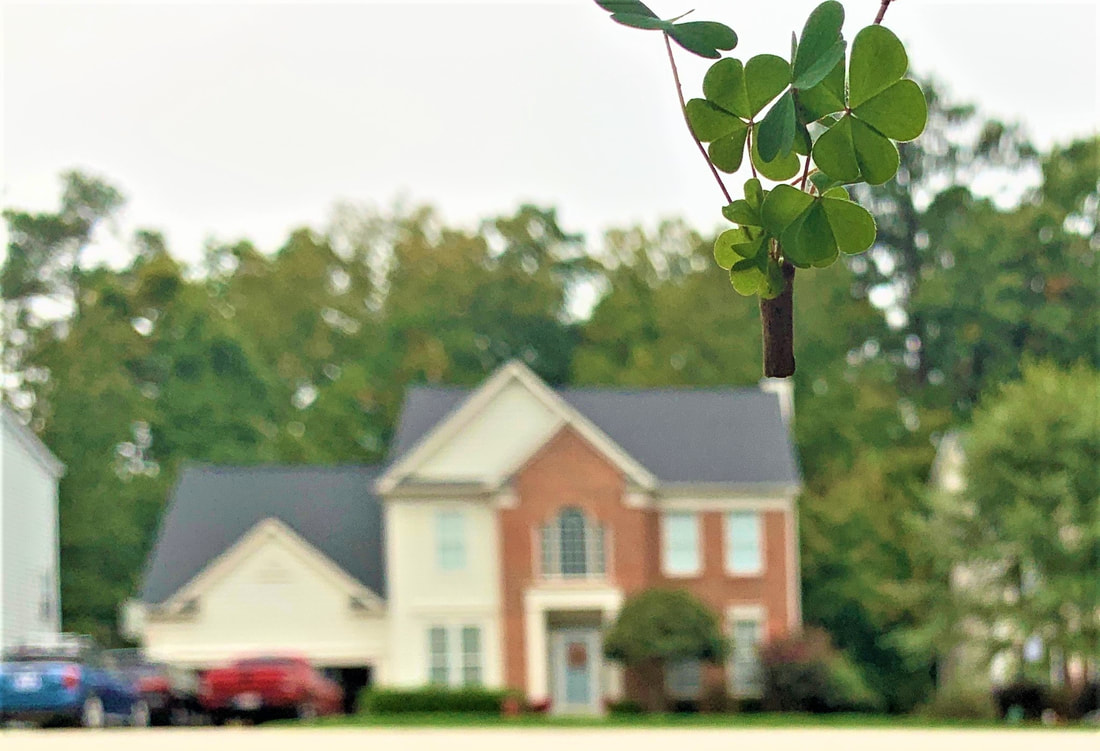
Towards the end of our perspective unit, we experimented with perspective in photography in addition to on paper like we have been doing. Doing this forced perspective assignment was really fun because it was an open-ended assignment that allowed me to be really creative. I took figures, plants, and other objects outside and other houses in my neighborhood to add as a backdrop for my photos. The photo to the right is the best one, in my opinion, out of the photos I took for the assignment. It shows a bouquet of clover sprouting out of a chimney of a house. In reality, the clover would have been super small compared to the house, but because the photo is forced perspective, it looks the same size as the house. If I did the forced perspective assignment again, I would try to use different objects, or maybe even my family to create more humorous forced perspective images. This assignment was probably my favorite out of all of the assignments in the perspective unit.
|
|
Pen and Ink
Pen Techniques on 3D Shapes
|
To start off our Pen and Ink unit, we watched multiple tutorials on how to create textures, values, and 3D shapes with pen. We started with 9 cubes, and drew different textures on each. I learned how to draw lines on the sides I wanted darker, so when I draw the design, it covered the lines and made it appear darker. The cubes were the easiest 3D shape to create and make look realistic, in my opinion, because you did not have to curve the texture like on the other two shapes. Next, we drew the cylinder. The cylinder was a little harder, because the lines, such as those on the jeweled (4th from the left) section, had to be curved to the side of the cylinder. The section I like the most on the cylinder was the wood at the very end. I think it turned out really well and was well shaped so it appeared 3D. Finally, we completed the textured spheres. I think that the spheres as a whole turned out the best. I drew a moon rock, fur ball, stone ball, a curly hair ball and a straight hair ball, two different wood textured balls, a scale-covered ball, and a rubber band ball. My favorite is either the curly hair, first wood ball, or the rubber band ball. The spheres, once I got a hang of the pattern to make them look 3D, were easier to draw that I thought. If I did this project again, I would experiment with different textures and shading techniques.
|
|
Pen Techniques
|
After watching tutorials and practicing in numerous activities drawing with pen, we started our pen and ink unit. For this activity, we were told to complete a basic graphite sketch of an interesting 3D object we selected from around us. I choose the Chapstick tube because it was the first thing I saw that was small but still visually interesting. It also showed great value when exposed to light. After sketching the object in pencil, we were told to go over it in pen, first tracing the sketch, then adding in more details. The hardest part about this assignment was the pen section. Drawing in pen can be very daunting for me, because I cannot draw that straight of lines, and if I mess up, there is no way to erase or cover it up. It was a little easier tracing the sides of the tube instead of freehanding it with pen, though. If I completed this assignment again, I would try to draw the tube a little less slanted and redraw the top somehow. I also would try to make the words at the bottom of the tube a little more curved to make the image look more realistic.
|
|
Graphite
|
Day 1 of Graphite, we learned about reference images and contour drawings. Our first assignment was to draw a bird, without a reference. Next, we had to draw a bird, but with a moving reference video. Both assignments didn't turn out quite right, but we learned that having a reference helps to get the proportions right, and produces better results than trying to draw something from memory. Finally, we learned about contour drawings, or outline drawings that do not have any shading, but all of the interior details. We first drew our hand with pen, and then four objects, two with pen and two with pencil. I drew an origami butterfly, wooden carved bison, marigold flower, and an origami flower. I discovered that pen is much easier to use when creating contour drawings. Day 3 of Graphite, we learned more about how to make 2D shapes look 3D through shading and adding value. We watched an informational video for tips and tricks for shading each shape, and then drew each shape and practiced in our sketch books. The hardest part of drawing each shape was getting the shape of the shadow right. The shadow had to be on the opposite side of the light source, and draw what that shape's outline would look like from that angle. If I drew these shapes again, I would fade out parts so they don't look as sharp or dark as they do now. (Such as the cylinder top and pyramid shadow.) |
To start off our week of Graphite, we learned about shading, how to get different darkness levels by changing the pressure on the pencil, and and how to make objects look 3D on a 2D surface. We had to first fill out a 9-step chart, with 10 different shades. Then we made a graphite gradient, which showed the different steps, like the first, but smoothed and with a gradual change, or gradient. The last part of the assignment was to make a cube, cylinder, sphere, and cone all look 3D, using shading and different light angles. We used skills we had learned in Art 1 to add dimension to each shape. For Day 2 of Graphite, we continued with contour line drawing. For our first assignment, we were told to draw the man in the chair, but while the picture was upside down. I actually found that the assignment was a little easier than just trying to draw an image right side up, because my brain will usually over-analyze the image and I will get the proportions of the image wrong. With this image, parts did not make sense unless it was right-side up, so I couldn't over-analyze this image. Next, we were told to draw 3 man-made objects and 3 natural objects in pen under a time limit. I drew a sandwich eraser, push pin, and mint for my man-made objects, and a flower, apple, and banana for my natural objects. These did not turn out as well as they could have because i felt very rushed drawing under a time constraint. For our last assignment, we had to draw a man-made and a natural object, one in pen and one in pencil, in 20 minutes. The 20 minutes felt very long at first, but looking back, it was good, because it made me focus on the details and add more to my drawings. |
