National Park Scene Collage
|
|
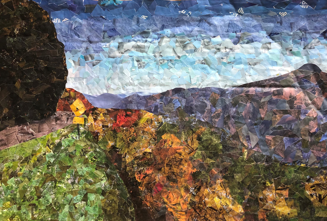
I chose to make a collage based on a picture I took in the Great Smoky mountains because I had a lot of fun on the trip, and because the trees and the mountains had a lot of color and vibrancy to bring to the piece. (1) My proportions for the image are probably the best out of almost any other piece I have made this year. Because of the size of the cardboard I used for the canvas of this piece, I decided to section the cardboard and the photo into 6 boxes, which also helped to draw the photo more accurately. I believe that I represented the shadows in the photo well, such as those on the road and grass/trees. I did this by cutting out images that had darker parts/shadows and darker shades of the same colors around the area to give the illusion of a shadow. (2) I used texture to add visual interest by cutting up not just solid colors, but pictures of clothing or plants or nature scenes that would have texture instead of being one solid color, even in the sky. This helped to also make the different aspects look more realistic. (3) I decided on the textures to use for my collage by looking at the photo and the magazines I had and picking out images that had the same colors and
|
values that I wanted to feature in my collage. For the shapes of the pieces in my collage, I just randomly cut out the different textures, so there was not really a uniform shape I used in my collage. (4) I do feel that I used a full range of values to properly reproduce my photo. Different values allowed me to create a gradient in the sky, as well as shadows in the trees, grass, and on the road. I also used value to create depth with a foreground, middle ground, and background to the collage. The brush, street, grass, and trees are vibrant and bright to create a foreground, while the largest mountain is made up of softer values to create a middle ground. Lastly, the mountains get softer and softer as they get farther away from the view, until they seem to fade into the sky, creating a background. (5) If I was to do this project again, I would definitely cut up the pieces into smaller pieces in areas such as the sky, road, and mountain to make the different textures and colors fit together more cohesively. (7) However, overall, I feel like I executed this piece really well, and I am very proud of the outcome. This was one of my neater pieces and definitely the most enjoyed piece I completed this semester. (6)
O'Keeffe Inspired Watercolor Painting
|
In this watercolor painting, layering of wash and wet on wet watercolor techniques proved to be most effective in creating the flower. For the background, I used a wet on wet technique to get the blurred feel of the background, and to add a color that would not take away from the flower itself too much. For each of the petals, the inside of the flower, and the stem, I used different layers of wash, along with layers of different colors, to get the color vibrancy and hue that I wanted on that part of the flower. (1) It was very important to use different layers of wash so that I could add different colors to the area and it be able to dry quickly, and get it to the exact vibrancy and color I needed it to be. (2) Color choice was an important factor in the success of my painting. The flower was a bright orange and yellow, so I had to try and achieve the vibrancy of the colors as best I could. Also, on areas such as the stem, I layered yellow and brown, and green and purple, to achieve the coloration of the stem, and also the shadows of the stem. (4) As well as color, composition was vital to the success of this painting. I believe that my composition of the flower captured the flower and image correctly in a way that was visually appealing. Naturally, the flower was divided, with the top 2/3s a bright orange and the bottom 1/3 being a softer, but still vibrant yellow. I utilized this division, zooming in on the flower, and placing the center of the flower in the bottom third of the paper. (3)
Georgia O'Keeffe's works served as an inspiration for this piece. I, like many of her works, chose a flower/piece of nature as my centerpiece for this piece. I also focused in on the flower and the different colors in it instead of trying to recreate the photo exactly. (5) If I was being a critic, I would definitely say that I could have spent more time on the petals and flower itself to make it look more realistic, such as the areas of shadows that are not represented as well as they could be in the painting. (7) However, overall I think that I did a pretty good job of constructing this piece. I feel like I referenced the photo a lot, and got the proportions of the photo correct, and also the colors of the flower. (6) If I were able to do something different, I would probably add more red and purple to certain places, and maybe even go back over areas with a colored pencil and add to some of the finer details, such as the orange on the yellow petals. (8) Through this painting, I have learned how to layer different colors to get the correct coloration that I want in different areas. I have to say that I probably will not try and watercolor any flowers realistically any time soon, as it takes a really long time and does not produce the results I wanted that much. (9) |

|
|
|
To practice with watercolors, we were given two images, one of peppers, and one of pears. Tasked to recreate one of these images with watercolor, I chose the peppers. I liked the idea of painting three different peppers of different colors, instead the very similar pears. First, I started by drawing the peppers themselves. I did not draw the shadow, because it was more of an organic shape and it would be easier to just paint it instead of drawing it. After drawing the shapes, I added different layers of wash to the peppers, leaving some spots white for highlights. To create shadows on each pepper, I added purple to red for the red pepper, a tan-brown to yellow for the yellow pepper, and a darker green and brown to green for the green pepper. After completing the papers, I started working on the shadows. While not using black, I used dark purples to create areas of darkness for the shadows. Different layers of wash allowed the shadow to fade out, like a realistic shadow would. After this project, I became much more confident using water colors, as well as conveying shadows and areas of light with water colors. If I could change anything on this piece, I would have added more details to the surface they are sitting on, instead of leaving them floating in the middle of the paper.
|
Colored Pencil Fruit/Vegetable Drawing
|
For this project, we were tasked with finding a fruit or vegetable to find and draw. I chose this tomato because of the wide range of colors and the highlights. I don't use colored pencils a lot, and blending with them was still new to me, so I knew this color variety would be a good challenge for me. First, I drew the tomato shape. I then scribbled a little with the different colors to establish where on the tomato I wanted to have these colors. Next, I started layering the different colors, adding different colors to certain areas to achieve the right hue and vibrancy to each section. The different colors I used are all on the last slide of the images to the right. After layering, I used a white colored pencil to add to the highlights on the top and bottom, and darker colored pencils, such as browns and some black to add to the darker shadow on the side of the tomato and the shadow on the surface. To ground the tomato drawing, I added both this shadow on the surface and a line in the horizon to make it seem like the tomato was sitting on a table. After this project, I feel much more confident with colored pencils and blending/shading with them. If I could change anything about the tomato, I would add more yellow, orange, and green to the side of the tomato, making it less red, and try to add more of a shine to the tomato, like what is seen in the image.
|
|
Pen Perspective Drawing
|
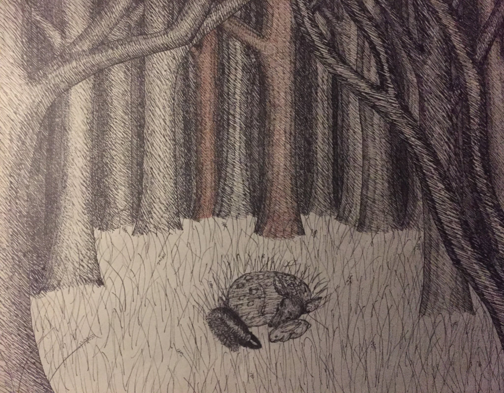
For the final project of the perspective unit, we chose to either draw a perspective scene, a scene in perspective of our interpretation of a fairy tale, or a perspective drawing inspired by the works of M. C. Escher. I chose to draw my interpretation of a scene from the fairy tale Bambi. When reading Bambi, I first imagined the three friends, Bambi, Thumper, and Flower, curled up peacefully in a forest clearing. Instead of the classic Disney looks of each of these characters and even the forest background, I used real life photos as references to portray each. To show the shading and perspective in the trees of the forest, I used a pen technique called hatching. Hatching is where you sketch dashes closer and farther apart to show shadow, depth, and dimension. It was very helpful to have learned how to hatch in class, because hatching helped to add value and perspective to this piece. Perspective is important to show in a drawing because it gives the piece a realistic look and adds depth. To show perspective, I drew multiple trees between each tree, and shaded them darker and darker as they receded further beyond the tree line of the clearing. The hatching added texture to the trees, giving them shadows while at the same time giving the appearance of bark on the trees. The hatching also gave the texture of fur to the animals in the center of the piece, which allows them to look more realistic and draws your eye to them. Value is especially important in this project because it allows me to show shadows on the trees, as well as show the difference between the animals, ground, and trees, while only using one color. I believe that the project was drawn quite neatly, and I am most proud of the hatching work on the trees. I shaded each tree individually, one at a time, to ensure that the trees could be told apart from one another and the background would not just blend together. If I recreated this piece, I would take more time on the ground and animals. Each animal had its own type of fur look to it, and I would have liked more time to try and draw and shade the animals. I also would have added color, to show the different values better and add more dimension to areas like the ground and the animals. As you can see in my final drawing, I had started to add color to the drawing to try and add more value to the different trees. Next project, I know that I have to spend more time on the little details like the animals and their fur. This project will help me grow as an artist because I now know how to create a background with a range of values that doesn't fade together, even while just using one color.
|
Unseen Things Drawing Project
|
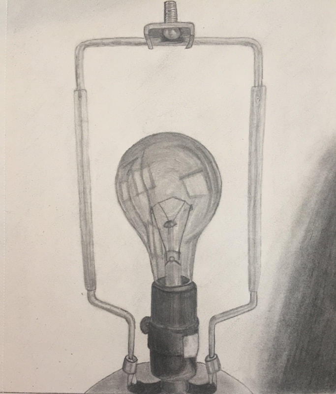
For this project, I started out by drawing a sketch of the light bulb, along with two other sketches of a home phone and light switch. (pictures 1 - 3) I chose to draw the light bulb because I hadn't ever drawn an object with glass before and wanted to try it out. To start, I drew a simple outline of the light bulb and the frame. (pic. 4) Next, I drew the lightbulb. The hardest part about the light bulb was trying to draw the inside parts of the light bulb and the reflections on the light bulb while still making them appear layered. To make it look 3D, I shaded the top like a sphere with a cylindric base, sketching contour lines and then blending them together so that they became smooth. (pic. 5) Then I started on the base, drawing it like a cylinder to make it appear rounded. Next I started on the frame, or the bars surrounding the light bulb. (pic 6 & 7) After working on the frame, I drew the screw mechanism on the top of the bars. Drawing the screw was the best part. I think it turned out really well, for it is shiny at parts. (pic. 8) Lastly, I drew the shadows and top of the base of the lamp. (final) The hardest section to draw was trying to shade the background to get the texture of the wall. I doesn't show up well in the pictures, but I believe it turned out well. (1)Composition was very important to the success of my drawing. Due to the fact that there wasn't anything very interesting that I could place in the background of the drawing, I made the light bulb a little bigger and moved it as far as I could to the middle of the page without the rest seeming proportionate. This allowed for the light bulb to draw the viewer's eye right away. (2) To find different values in my object, I turned off all of the lights and opened all of the windows. This allowed for a lot of natural light to highlight the light bulb and create shadows. The windows showed up on the lightbulb as well, which you can see clearly in my final drawing. (3) I think I did achieve a full range of different values in my drawing. The base and parts of the light bulb brought darker shades, and the highlights on the light bulb and bars brought the middle values to the drawing. The highlights of the bars and background show the lightest values. I achieved the full range of values by using sketch pencils of softer and harder graphite, then blending them together to produce gradients. (4) My artwork was executed pretty well and neatly. (5) If I completed the project again, I might have put the lamp on the ground to get some waistcoating in the background, or make the background darker. Keeping the background so light was hard because I used a lot of graphite on the light bulb and base, and the side of my hand would smear it often. Learning about shading, depth, and how to make shapes look 3D was very helpful to learn about prior to this assignment. For the light bulb and base specifically, knowing how to do all of the before mentioned things was very helpful when showing light and reflections on the light bulb, and making the base look rounded. (6) I grew as an artist because I had never really drawn an object with reflections on it like the light bulb, or anything with glass really. Learning how to draw the insides of the light bulb while still correctly shading the light bulb outside and reflections was very hard, but also fun to try. (7) During this assignment, I did not have access to a good blender like we would have used in class. Instead, i wrapped a strip of tissue around the end of a pencil and used it to shade, and it worked alright. Also, when I first drew the light bulb, it looked very 2D, but when I drew the top like it was sphere, and the bottom part like a cylinder and shaded with contour lines, it made it look more 3D. (8)
|
|
"Living in Darkness" Photo Series
For the photo series assignment, I choose to focus of the positive aspects of quarantine and virtual school. This in mind, I chose things that made me happy that had happened because of quarantine. My first photo was one I took of my dog, Yogi. I have been able to spend more time with my dog because of quarantine, and it has made me even closer to him than I was before. When editing, I left the photo mostly untouched because the image felt too edited and even fake whenever I added filters or messed with the different lighting or color aspects of the photo. After trying to get the image to look right too many times, I finally decided that it was best just to add a few changes, but leave the rest untouched, to give it a more natural look. My second photo was a photo of a strawberry plant leaf. This photo, unlike the other two, was meant to look edited and more artistic than natural. It represented how I've been able to do a lot of different art projects over quarantine, and how my family and I have also been able to grow a lot of different plants, such as the strawberry plant. To start, I misted the leaves, to get the dew look. Next, I took a whole bunch of pictures, and chose the one level with the leaf, because I liked the focus and composition of the photo. I decided to use the "mono" filter on this picture because I thought it would really emphasize the water droplets and the texture of the leaves. For my last photo I used one of my chickens. At the beginning of quarantine, we got chicks, and now the chickens are all grown up and about to start laying. For this photo, much like the first, I wanted to leave it more or less natural, but it was very dark to start, so I added a lot of light.
My favorite part about creating this photo series was taking the photos, and experimenting with the different filters and edits. I think my best photo in this collection artistically is the strawberry leaf. Changing the photo to black and white really emphasized the texture of the veins of the leave, and added contrast between the water and leaf, making the droplets stand out more. If I did another photo series, I might have done a color series with my dog, the chickens, and another photo, and another separate, exclusively black-and-white photo series of plants. While I really like all of these photos, the black and white aesthetic of the strawberry leaf photo does not really tie in that well with the other two more colorful photos.
My favorite part about creating this photo series was taking the photos, and experimenting with the different filters and edits. I think my best photo in this collection artistically is the strawberry leaf. Changing the photo to black and white really emphasized the texture of the veins of the leave, and added contrast between the water and leaf, making the droplets stand out more. If I did another photo series, I might have done a color series with my dog, the chickens, and another photo, and another separate, exclusively black-and-white photo series of plants. While I really like all of these photos, the black and white aesthetic of the strawberry leaf photo does not really tie in that well with the other two more colorful photos.
Photography Composition
|
|
For our photography project, we focused on mainly composition and editing. Using the rule of thirds and golden spiral composition techniques, we cropped the picture to better place our object in the photo. Next, we put filters on the picture, added more contrast, and enhanced different aspects of the picture.
As you can see, we also focused on positive versus negative space in the photos, as well as foreground, middle ground, and background. My subjects, which were caterpillars on a dill plant in my front yard, were the main thing in the foreground in each picture. The dill plant varied whether it was in the foreground, middle ground, and/or the background from picture to picture. In the very background, there are other plants, which did not have enough difference to distract from the main subject, but enough color to add more visual appeal to each picture. Having a foreground, middle ground, and background also allow for good eye movement. Your eye is drawn to the caterpillar in the foreground first, then the darker things int he background, and back to the caterpillar. Some other photos allow for more randomized eye movement, while some almost make you zero your eye on one spot. |
|
One thing we had to make sure we didn't have too much of was space. If we had too much negative space, or too much background and not enough to focus on the foreground, it would throw off the balance of the photograph. The reverse of this was also the point where the foreground was all you saw. For example, think of that flower you drew in grade school. It took up most of the space and there was maybe a cloud or two in the background, and that was about it. As you grew up, you might have started to add hills or trees in the background, move the flower and make it smaller, maybe even give it a friend. Most pieces of art, including drawings and photos, have a foreground, middle ground, and background to make the piece more interesting and visually appealing to look at. If any of my photos had just captured the caterpillar, or just the plants in the background, the photo wouldn't be that fun or interesting to look at.
I chose caterpillars for my subject of the photographs because they have the bright spots of yellowish-orange on their backs, which brought out the yellow of the dill flowers, and because of the black and white bands along their body, which allowed for great contrast against the green and tan backgrounds. They are also very small and cute to me, and I wanted to photograph something alive, because I could get more, different angles out of them as they moved around. |
|
I am very proud of my photographs. The compositions of each picture is evident, and the different filters I used almost made each picture seem like part of a collection. I learned a lot about composition, contrast, and about editing photos through this project. Before this photography project, I really had only dabbled in photography, mostly only for fun or when my family went on vacation. This project really helped me to understand how to take a visually appealing picture, that captures what you want to without people getting distracted by other things in the photo. If I had to do this project again, I would probably take more pictures in the beginning, to have more to choose from to edit at the end.
4 Assessment Drawings
|
|
For my first Art 2 assignment, we were told to draw 4 images. Shoes with laces, a one-point perspective street view, a portrait, and a hand.
I started with the shoes, arranging my tennis shoes on my desk and sketching them. I first drew the top shoe, starting with a basic shape, then doing the curve of the sole of the shoe, toe, fabric on the side and logo, then the top of the shoe, ending with the laces. My tennis shoe is a knitted fabric, and I tried to show this with the small dots on the fabric. Next, I did the bottom shoe, which only showed the bottom of the shoe and a little of the back. If I drew my shoes again, I would fix the curve on the front of the top shoe and shade both the top and bottom shoe more. Next, I did my hand. I started out with my hand flat out and tried to draw that shape but I kept making my fingers too fat, so I tried a different shape. I kind of formed a relaxed letter "a" (sign language) and started with my thumb. I did an outline of each finger, adding the finger fold lines and the lines on my knuckles as I went. The hardest part was trying to draw my wrist and arm at an angle that wouldn't make it look broken or something. When I finished with the finger and lines, I went back and shaded. Then I started on the one-point street perspective. One-point perspective drawing has always been really fun and interesting to me. I do not always do that well with organic shapes, and straight lines are easier in that aspect. I started by researching a little, looking up one-perspective street views. Most had the road looking like it would go on forever, like I drew mine, and had flat roofs. I discovered that it was really difficult to draw sloped or pointed roofs like you might see on a house. Finally, I drew the portrait. I drew a picture of my sister from a picture I took of her while were on a vacation. Starting with her hairline, I outlined her face. The hardest part about the portrait drawing was trying to not give her a big forehead and making sure all of the parts of her face were proportionate. |
